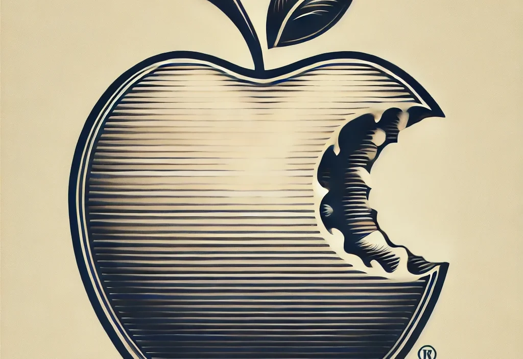
The Evolution of the Original Apple Logo
When we think of Apple today, we immediately picture the sleek, minimalist logo that graces their cutting-edge products. However, this iconic symbol has a fascinating and rich history, one that dates back to the very beginnings of the company.
The Birth of a Legend
In 1976, when Steve Jobs and Steve Wozniak founded Apple, they needed a logo that would represent their brand identity. They approached Rob Janoff, a talented graphic designer, to create a logo that would convey their vision of simplicity, elegance, and innovation.
Design Elements
Janoff’s design featured a rainbow-colored apple with a bite taken out of it. The rainbow stripes were revolutionary at the time, symbolizing Apple’s commitment to bringing color and creativity to the world of technology. The bite mark added a playful touch, making the logo memorable and distinctive.
Symbolism and Legacy
The apple itself was a nod to the discovery of gravity by Sir Isaac Newton, tying in with Apple’s mission to push the boundaries of conventional thinking. The rainbow colors represented the company’s inclusive approach and the idea that technology should be accessible to everyone.
Conclusion
The original Apple logo may have evolved over the years, but its legacy lives on in the brand’s commitment to innovation, creativity, and pushing boundaries. It serves as a reminder of the company’s humble beginnings and its journey to becoming a global tech giant.
List of trusted resources
Here are some trusted resources on the Apple logo’s history:
- Crowdspring – An overview of the logo’s evolution and design.
- Apple Scoop – Insights on the logo’s transformation and its impact on branding.
- Inkbot Design – Learn about the logo’s design influences and significance.
- DesignBro – Detailed history of the Apple logo and its meaning.
- Fabrik – A concise guide on the logo’s symbolism and evolution.


